In this tutorial, we'll learn what is the problem with component-based styling and why we need utility-based styles. Also, we'll explore TailwindCSS which is a utility-first CSS framework. We'll also learn about how to install, configure and learn TailwindCSS with a React app.
Table of Contents
- Introduction
- Getting started with TailwindCSS
- Installing TailwindCSS
- Configuring TailwindCSS
- Using it with React
- Extracting components
- Conclusion
Introduction
As a front-end developer, I've worked on projects having a large codebase. The most common problem that arises after a prolonged period of development is managing styles and this problem is very common. Although we've many CSS architectures like Atomic CSS, BEM, ITCSS, SMACSS, etc., we still have the problem with managing them. Added to this, we can also have CSS performance issues as well.
In the codebase which I was working on, we started with BEM for writing HTML and CSS. In a sub-module of that project, we'd used Bootstrap. Also, in some legacy code of that codebase, we've custom CSS that wasn't following any convention.
While all these CSS architecture tries to help us solve these kinds of problems, it'd been easier if we could just write utility class and then use them repeatedly in our codebase. These utility classes would be exhaustive and could be present as a standalone guideline for padding, margin, font-size, etc.
Using utility classes would solve the problem of duplicate styles as we wouldn't need to write anymore custom style definitions. Moreover, if our styleguide follows a particular standard, we could also follow the same in development. One such utility framework is TailwindCSS.
Getting started with TailwindCSS
TailwindCSS is a utility-first CSS framework which aims to provide us with a set of utlity classes (like flex, block, inline-block, etc.). In addition to that, it also provides us utility classes to create CSS grids, responsive designs as well as style hover, focus and active pseudo-classes.
I'd be using TailwindCSS with React. However, the same principles will apply to any framework, library as well only HTML.
Installing TailwindCSS
We'll use Create React App to bootstrap our project. To do that, we'll have to run the following command:
npx create-react-app my-app
Next, we need to go inside the my-app directory and install TailwindCSS:
cd my-app && yarn add tailwindcss
If you prefer npm, you can run the following command instead of the above one:
cd my-app && npm install tailwindcss
Next, we need to use the @tailwind directive to inject Tailwind's base, components, and utilities styles into our CSS. To do that we need to add the following code to our src/styles/vendors.css file:
@tailwind base;
@tailwind components;
@tailwind utilities;
Next, we need to add the build:style script to our package.json file:
"scripts": {
  "start": "react-scripts start",
  "build": "react-scripts build",
  "test": "react-scripts test",
  "eject": "react-scripts eject",
  "build:style": "tailwind build src/styles/vendors.css -o src/styles/tailwind.css"
},
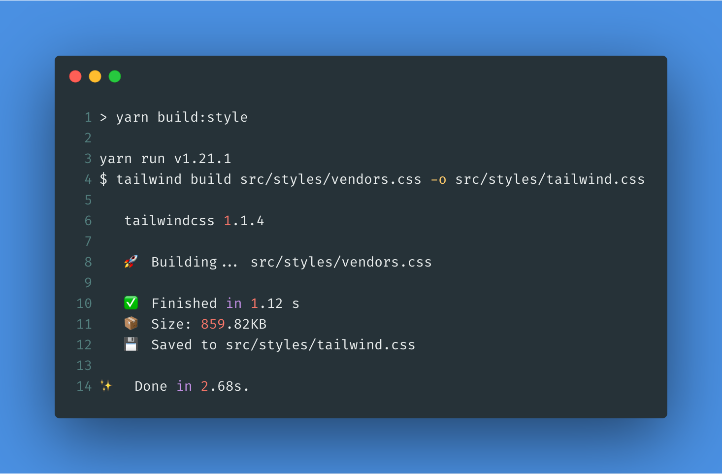
Now, the build:style command will generate a new src/styles/tailwind.css file whenever we run it:
Next, we need to add the generated file to our src/App.js file:
import React from "react";
import logo from "./logo.svg";
import "./App.css";
import "./styles/tailwind.css";
That's all we need to do to make TailwindCSS work with Create React App. To verify whether TailwindCSS is working or not, we can add a TailwindCSS class. We can add the bg-blue-900 class to our <header> in src/App.js file:
<div className="App">
  <header className="App-header bg-blue-900">
    <img src={logo} className="App-logo" alt="logo" />
    <p>
      Edit <code>src/App.js</code> and save to reload.
    </p>
Now, if we can run our server using the following command:
yarn start
Once our server is up and running, we can visit http://localhost:3000:
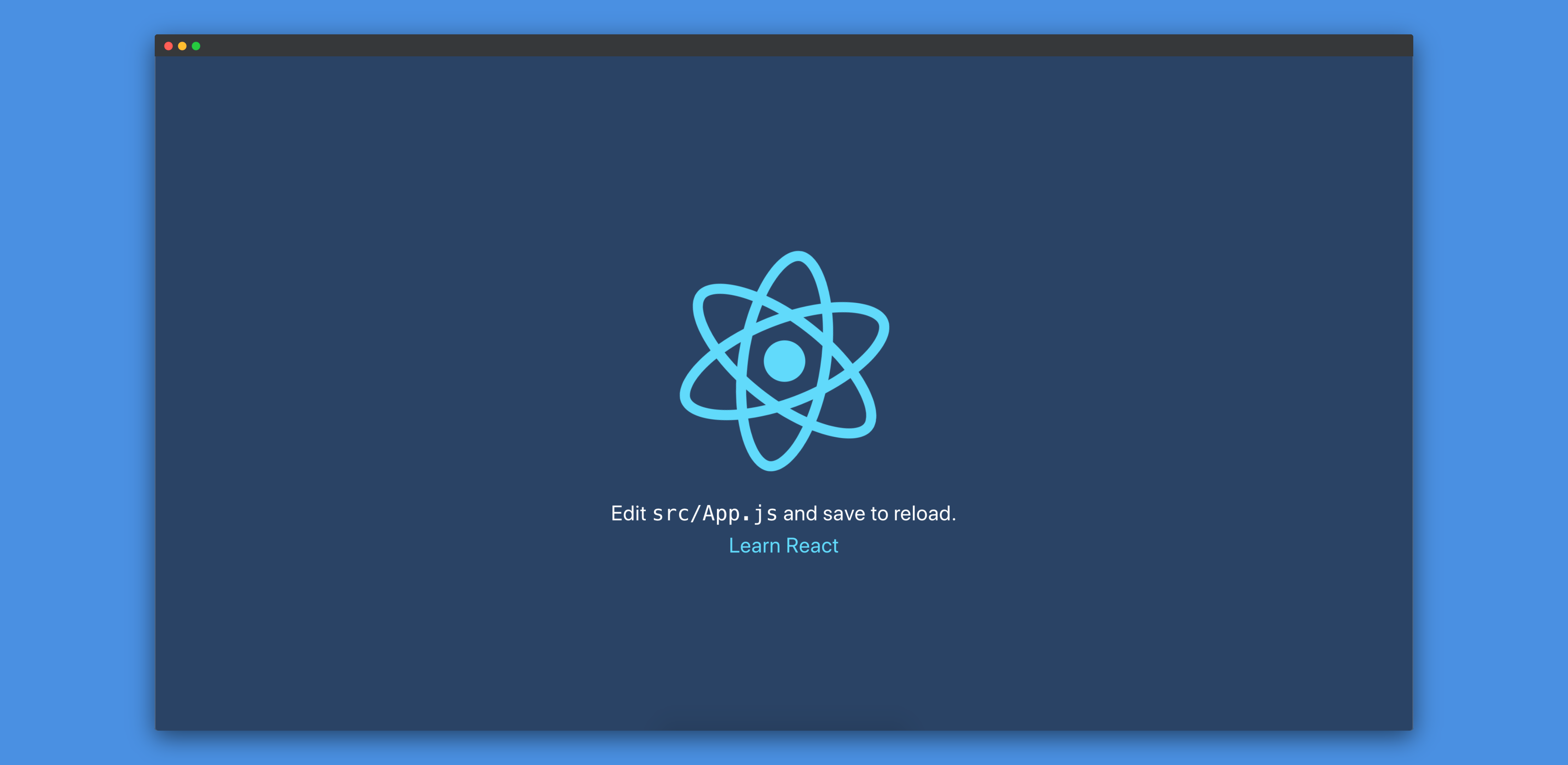
We can see that the background-color has changed to #2a4365 which is listed on TailwindCSS background color.
Configuring TailwindCSS
By default, the size of Tailwind is 78.0kb (gzipped) compared to Bootstrap's 22.7kb (gzipped). But, this size can be reduced using a number of strategies. We won't go through all of them. However, we'll configure using Tailwind config file to reduce the size.
First, we need to generate a Tailwind config file. We can do that by running the following command:
npx tailwind init
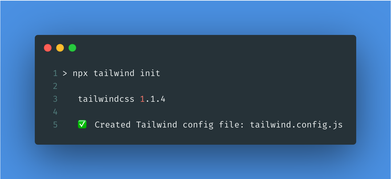
This will create a new file tailwind.config.js at the root of our project:
module.exports = {
  theme: {
    extend: {},
  },
  variants: {},
  plugins: [],
};
Through this configuration file, we can override Tailwind's default color palette or extend it. We can also disable certain colors.
Now, let's say we want to use Tailwind in your existing codebase. Our existing codebase already has a bunch of custom CSS styles defined in it. It's highly likely that we might have defined some custom utility classes (like text-red, text-bold, block, flex, etc.). The problem which arises now is that the Tailwind utility classes might interfere with our existing classes. We can solve that problem by adding a prefix to all of Tailwind's generated utility classes.
For example, if we want to add the prefix u- ('u' stands for utility) to Tailwind's classes, we just need to add that to the configuration file we generated above:
module.exports = {
  prefix: "u-",
  theme: {
    extend: {},
  },
  variants: {},
  plugins: [],
};
Now, if we build our styles again using yarn build:style, we'll get classes like u-bg-blue-900. Let's replace bg-blue-900 to u-bg-blue-900 in our src/App.js file:
<div className="App">
  <header className="App-header u-bg-blue-900">
    <img src={logo} className="App-logo" alt="logo" />
    <p>
Now, if we visit http://localhost:3000, we'll see that it's same as before.
We can also add plugins as well as modify the separator.
If we see that the Tailwind classes are not reflecting on the browser, it could be due to the fact that some other classes are overriding the styles provided by Tailwind. To solve that problem, we can configure Tailwind to always use !important after each class.
To do that we just need to add the following code to the configuration file:
module.exports = {
  prefix: "u-",
  important: true,
  theme: {
    extend: {},
  },
  variants: {},
  plugins: [],
};
Now, if we build our styles again using yarn build:style, we'll get styles like:
.u-bg-gray-900 {
  background-color: #1a202c !important;
}
I wouldn't suggest using
!importantas it's not always the best solution for solving CSS specificity issues.
Using it with React
After we're done integrating TailwindCSS with our React project, let's develop a page using TailwindCSS.
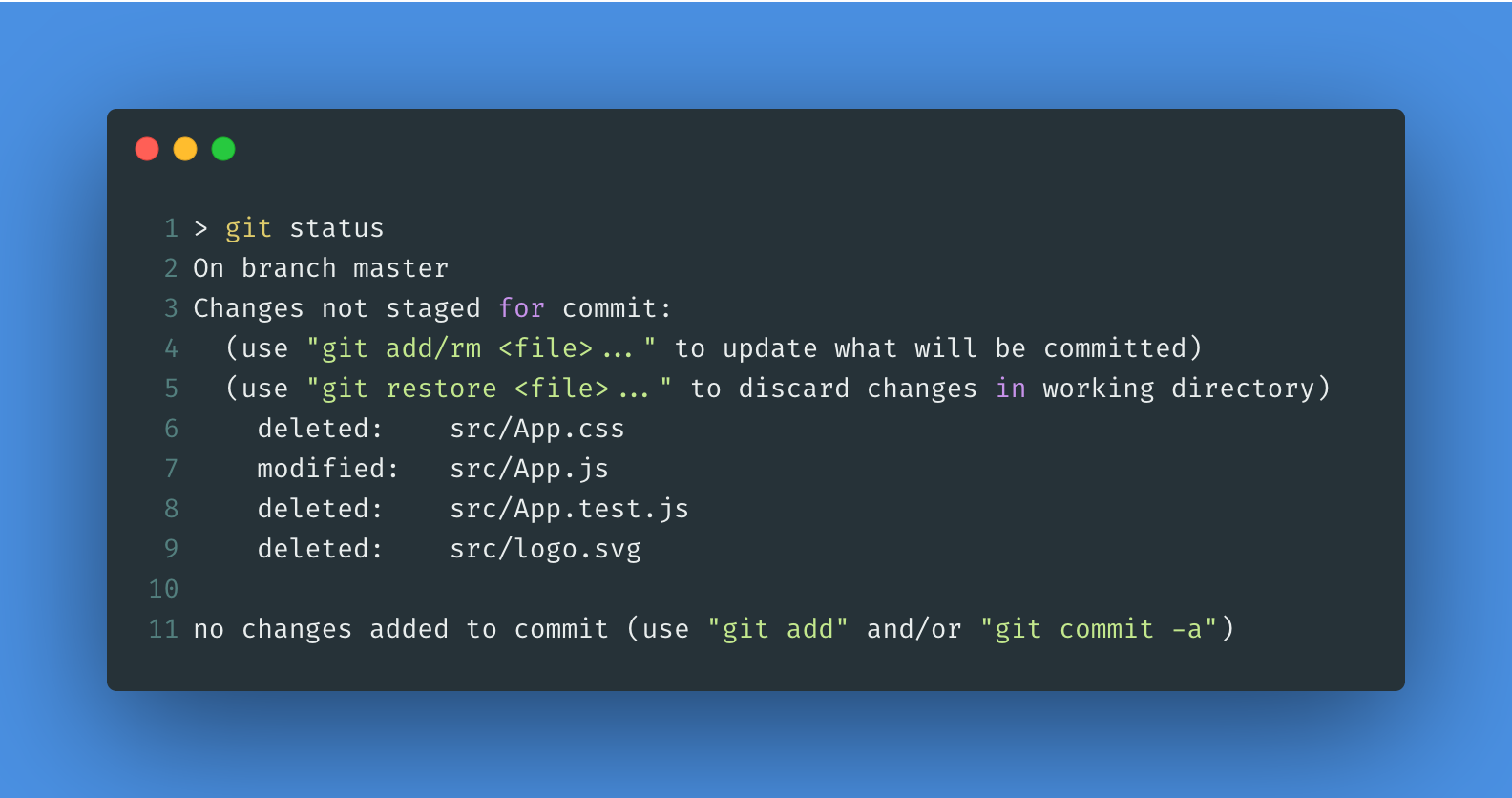
First, let's remove all the code from our src/App.js file and then remove the src/App.css, src/App.test.js and src/logo.svg files.
Our src/App.js file should look like the following:
import React from "react";

import "./styles/tailwind.css";

function App() {
  return <div>TailwindCSS with React!</div>;
}

export default App;
We're now in a position to develop our first page using React and style it with TailwindCSS. We'll add a navbar first and then, we'll add a card to the page. To create the navbar, we can look at the Responsive Header example component from Tailwind.
Let's introduce that component into our src/App.js file:
import React from "react";

import "./styles/tailwind.css";

function App() {
  return (
    <nav className="flex items-center justify-between flex-wrap bg-teal-500 p-6">
      <div className="flex items-center flex-shrink-0 text-white mr-6">
        <svg
          className="fill-current h-8 w-8 mr-2"
          width="54"
          height="54"
          viewBox="0 0 54 54"
          xmlns="http://www.w3.org/2000/svg"
        >
          <path d="M13.5 22.1c1.8-7.2 6.3-10.8 13.5-10.8 10.8 0 12.15 8.1 17.55 9.45 3.6.9 6.75-.45 9.45-4.05-1.8 7.2-6.3 10.8-13.5 10.8-10.8 0-12.15-8.1-17.55-9.45-3.6-.9-6.75.45-9.45 4.05zM0 38.3c1.8-7.2 6.3-10.8 13.5-10.8 10.8 0 12.15 8.1 17.55 9.45 3.6.9 6.75-.45 9.45-4.05-1.8 7.2-6.3 10.8-13.5 10.8-10.8 0-12.15-8.1-17.55-9.45-3.6-.9-6.75.45-9.45 4.05z" />
        </svg>
        <span className="font-semibold text-xl tracking-tight">
          Tailwind CSS
        </span>
      </div>
      <div className="block lg:hidden">
        <button className="flex items-center px-3 py-2 border rounded text-teal-200 border-teal-400 hover:text-white hover:border-white">
          <svg
            className="fill-current h-3 w-3"
            viewBox="0 0 20 20"
            xmlns="http://www.w3.org/2000/svg"
          >
            <title>Menu</title>
            <path d="M0 3h20v2H0V3zm0 6h20v2H0V9zm0 6h20v2H0v-2z" />
          </svg>
        </button>
      </div>
      <div className="w-full block flex-grow lg:flex lg:items-center lg:w-auto">
        <div className="text-sm lg:flex-grow">
          <a
            href="#responsive-header"
            className="block mt-4 lg:inline-block lg:mt-0 text-teal-200 hover:text-white mr-4"
          >
            Docs
          </a>
          <a
            href="#responsive-header"
            className="block mt-4 lg:inline-block lg:mt-0 text-teal-200 hover:text-white mr-4"
          >
            Examples
          </a>
          <a
            href="#responsive-header"
            className="block mt-4 lg:inline-block lg:mt-0 text-teal-200 hover:text-white"
          >
            Blog
          </a>
        </div>
        <div>
          <a
            href="#"
            className="inline-block text-sm px-4 py-2 leading-none border rounded text-white border-white hover:border-transparent hover:text-teal-500 hover:bg-white mt-4 lg:mt-0"
          >
            Download
          </a>
        </div>
      </div>
    </nav>
  );
}

export default App;
If we visit http://localhost:3000, it'll look like the following:
Our page looks like it's without styles. This is because we've prefixed with u- in our Tailwind configuration file. Let's remove that for now so that our tailwind.config.js file looks like the following:
module.exports = {
  important: true,
  theme: {
    extend: {},
  },
  variants: {},
  plugins: [],
};
If we run yarn build:style, Tailwind will generate a new set of classes and update our src/styles/tailwind.css file with them.
If we visit http://localhost:3000, it'll now look like the following:
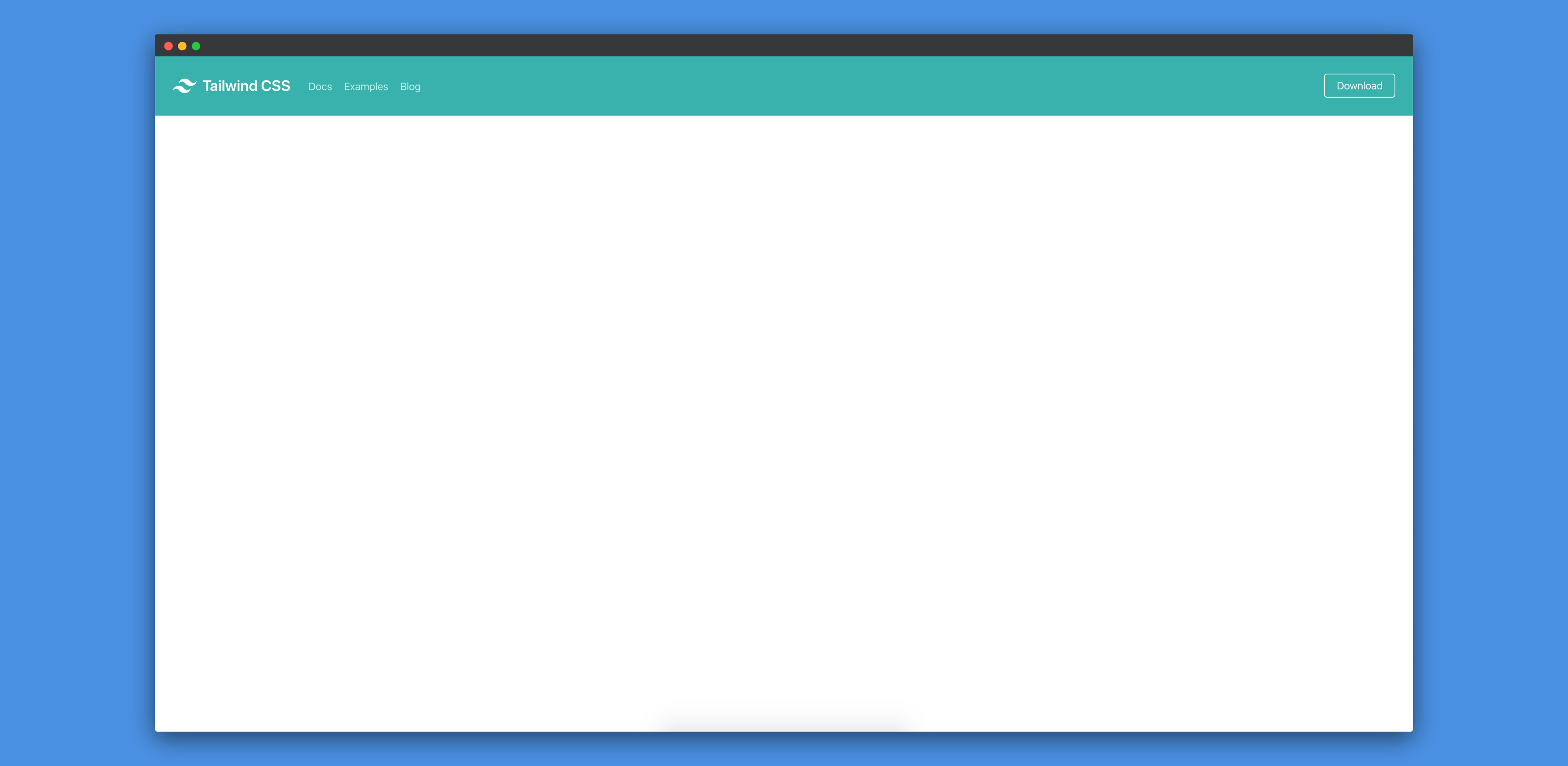
Now, it looks as expected. Let's now add a card component to this. We just need to add the following code to our src/App.js file:
<div className="flex items-center justify-center h-screen bg-gray-200">
  <div className="max-w-md">
    <div className="rounded overflow-hidden shadow-lg">
      <img
        className="w-full"
        src="https://tailwindcss.com/img/card-top.jpg"
        alt="Sunset in the mountains"
      />
      <div className="px-6 py-4 bg-white">
        <div className="font-bold text-xl mb-2">The Coldest Sunset</div>
        <p className="text-gray-700 text-sm">
          Lorem ipsum dolor sit amet, consectetur adipisicing elit. Voluptatibus
          quia, nulla! Maiores et perferendis eaque, exercitationem praesentium
          nihil.
        </p>
      </div>
      <div className="px-6 py-4 bg-gray-100">
        <span className="inline-block bg-gray-300 rounded-full px-3 py-1 text-sm font-semibold text-gray-700 mr-2">
          #photography
        </span>
        <span className="inline-block bg-gray-300 rounded-full px-3 py-1 text-sm font-semibold text-gray-700 mr-2">
          #travel
        </span>
        <span className="inline-block bg-gray-300 rounded-full px-3 py-1 text-sm font-semibold text-gray-700">
          #winter
        </span>
      </div>
    </div>
  </div>
</div>
You'll need to wrap the whole
Appfunction with<React.Fragment>as React doesn't allow a component to return multiple elements.
If we visit http://localhost:3000, it should now look like the following:
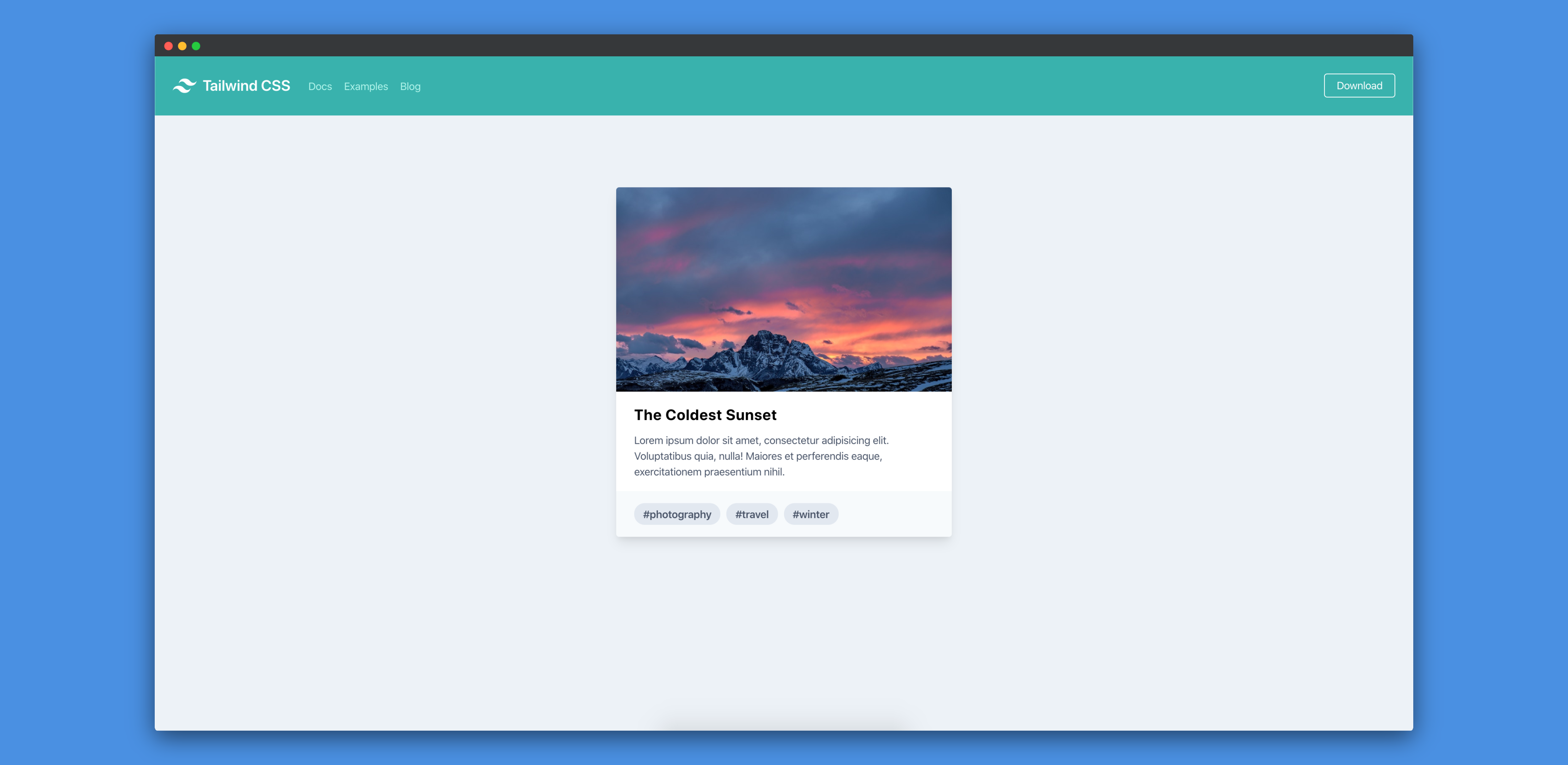
This is how we expected our page to look like.
Extracting components
Till now, we designed the whole page inside one single file. However, we'll most probably have multiple components inside an actual app. We might also want to re-use the same navbar across many pages (we can also add the navbar to a common parent file). Also, we might to re-use the card component as well. So, let's try to extract the card component in a separate file.
Let's create a new file src/Card.js and move the card styles from src/App.js file to that file:
import React from "react";

function Card() {
  return (
    <div className="max-w-md">
      <div className="rounded overflow-hidden shadow-lg">
        <img
          className="w-full"
          src="https://tailwindcss.com/img/card-top.jpg"
          alt="Sunset in the mountains"
        />
        <div className="px-6 py-4 bg-white">
          <div className="font-bold text-xl mb-2">The Coldest Sunset</div>
          <p className="text-gray-700 text-sm">
            Lorem ipsum dolor sit amet, consectetur adipisicing elit.
            Voluptatibus quia, nulla! Maiores et perferendis eaque,
            exercitationem praesentium nihil.
          </p>
        </div>
        <div className="px-6 py-4 bg-gray-100">
          <span className="inline-block bg-gray-300 rounded-full px-3 py-1 text-sm font-semibold text-gray-700 mr-2">
            #photography
          </span>
          <span className="inline-block bg-gray-300 rounded-full px-3 py-1 text-sm font-semibold text-gray-700 mr-2">
            #travel
          </span>
          <span className="inline-block bg-gray-300 rounded-full px-3 py-1 text-sm font-semibold text-gray-700">
            #winter
          </span>
        </div>
      </div>
    </div>
  );
}

export default Card;
Let's import that Card component into our src/App.js file:
import React from "react";

import Card from "./Card";

import "./styles/tailwind.css";

function App() {
  return (
    <React.Fragment>
      <nav className="flex items-center justify-between flex-wrap bg-teal-500 p-6">
        <div className="flex items-center flex-shrink-0 text-white mr-6">
          <svg
            className="fill-current h-8 w-8 mr-2"
            width="54"
            height="54"
            viewBox="0 0 54 54"
            xmlns="http://www.w3.org/2000/svg"
          >
            <path d="M13.5 22.1c1.8-7.2 6.3-10.8 13.5-10.8 10.8 0 12.15 8.1 17.55 9.45 3.6.9 6.75-.45 9.45-4.05-1.8 7.2-6.3 10.8-13.5 10.8-10.8 0-12.15-8.1-17.55-9.45-3.6-.9-6.75.45-9.45 4.05zM0 38.3c1.8-7.2 6.3-10.8 13.5-10.8 10.8 0 12.15 8.1 17.55 9.45 3.6.9 6.75-.45 9.45-4.05-1.8 7.2-6.3 10.8-13.5 10.8-10.8 0-12.15-8.1-17.55-9.45-3.6-.9-6.75.45-9.45 4.05z" />
          </svg>
          <span className="font-semibold text-xl tracking-tight">
            Tailwind CSS
          </span>
        </div>
        <div className="block lg:hidden">
          <button className="flex items-center px-3 py-2 border rounded text-teal-200 border-teal-400 hover:text-white hover:border-white">
            <svg
              className="fill-current h-3 w-3"
              viewBox="0 0 20 20"
              xmlns="http://www.w3.org/2000/svg"
            >
              <title>Menu</title>
              <path d="M0 3h20v2H0V3zm0 6h20v2H0V9zm0 6h20v2H0v-2z" />
            </svg>
          </button>
        </div>
        <div className="w-full block flex-grow lg:flex lg:items-center lg:w-auto">
          <div className="text-sm lg:flex-grow">
            <a
              href="#responsive-header"
              className="block mt-4 lg:inline-block lg:mt-0 text-teal-200 hover:text-white mr-4"
            >
              Docs
            </a>
            <a
              href="#responsive-header"
              className="block mt-4 lg:inline-block lg:mt-0 text-teal-200 hover:text-white mr-4"
            >
              Examples
            </a>
            <a
              href="#responsive-header"
              className="block mt-4 lg:inline-block lg:mt-0 text-teal-200 hover:text-white"
            >
              Blog
            </a>
          </div>
          <div>
            <a
              href="#"
              className="inline-block text-sm px-4 py-2 leading-none border rounded text-white border-white hover:border-transparent hover:text-teal-500 hover:bg-white mt-4 lg:mt-0"
            >
              Download
            </a>
          </div>
        </div>
      </nav>
      <div className="flex justify-around h-screen bg-gray-200 pt-24">
        <Card />
      </div>
    </React.Fragment>
  );
}

export default App;
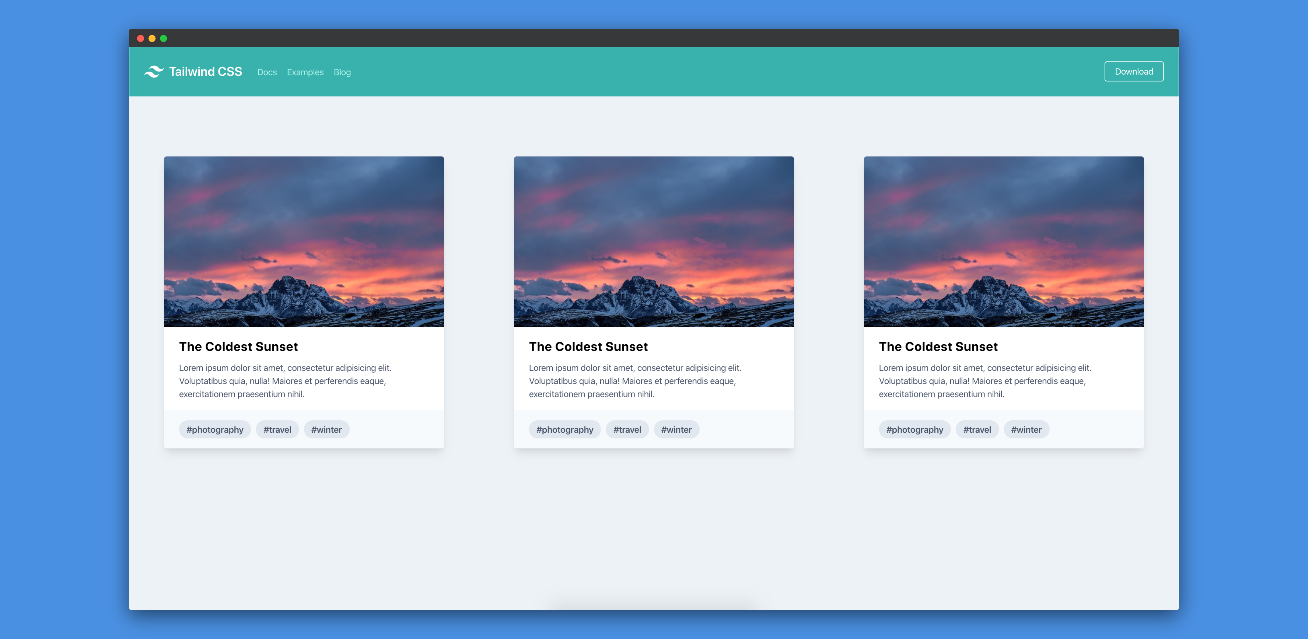
Let's add two more Card components to our src/App.js file:
<div className="flex justify-around h-screen bg-gray-200 pt-24">
  <Card />
  <Card />
  <Card />
</div>
If we visit http://localhost:3000, we'll see three cards now:
We can also do the same thing for navbar as well. We can create a navbar component using the code which is related to navbar.
Conclusion
In this tutorial, we've learnt how to use TailwindCSS to build scalable front-end applications. We've also noticed that we can design, develop and ship front-end applications much faster as we don't have to worry about writing custom CSS styles any more. Our applications will become more maintainable as we don't have to worry about removing CSS styles. Tailwind also has a section describing about how to control file size.
Tailwind supports IE11 and all the latest versions of Chrome, Firefox, Safari, and Edge.
I hope that this tutorial helps you in your future projects.